
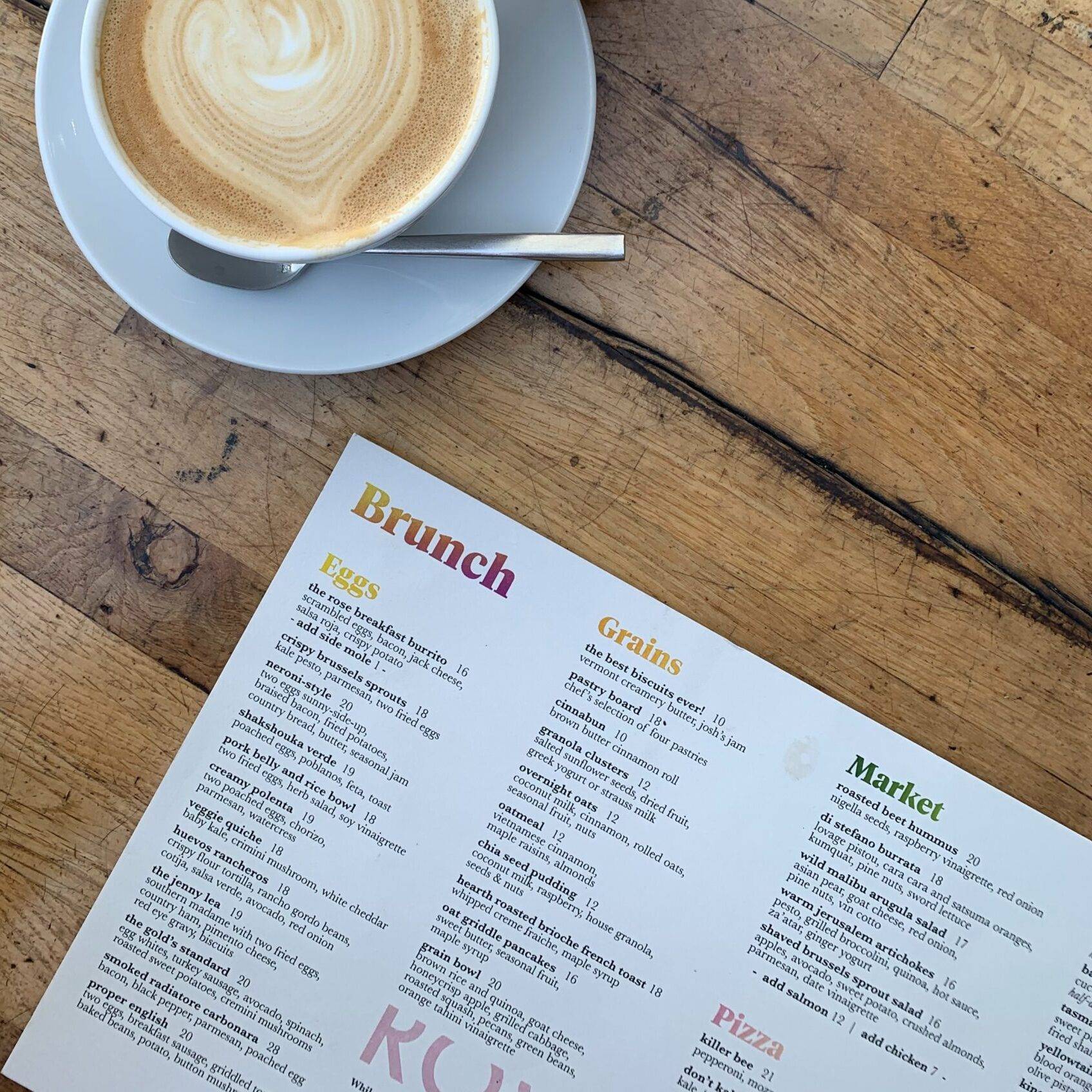
A café menu gets handled constantly. It travels from table to table, sits beside mugs and plates, and is read by people who may have just finished a sticky pastry. It needs to look inviting, be easy to read and cope with everyday use.
For this Friday’s Behind the Business / Service Spotlight, we’re looking at a folded menu job for an anonymised local food business in Devon. We’ve kept the client’s name, menu and exact order details private. The choices below show how we approach a representative project of this kind, using the formats and print options available through our in-house team in Tavistock.
The brief, clear information in a busy café
The café needed a menu that could sit comfortably on tables without taking up too much space. It had to bring food and drink choices together, make prices easy to scan and still feel welcoming.
There was a practical snag. A menu on a table is not a one-use leaflet. It gets picked up, passed around and put down again, sometimes next to a freshly poured drink. A lightweight sheet might suit a short promotion, but for regular handling the paper and finish needed more thought.
We began with the job the menu had to do, not with a particular paper weight. How much information needed to fit? Would customers read it flat or open it out? How often might the menu change? And what kind of cleaning would the café use?
Those answers shaped the format, stock and finish.
The format, a leaflet that opens out
A folded leaflet offers more room than a single flat sheet while staying compact on the table. For this example, an A4 sheet folded once creates an A5-sized menu when closed. Open it out and there are four panels to organise, including the cover and the inside pages.
That structure gave the café a simple way to group its information. A customer could see the main offer at a glance, then open the menu for the full selection. It also meant the layout had to be designed around the fold, so headings, prices and important details did not land awkwardly across a crease.
Our folded menu printing page outlines available sizes and fold options. The listed paper size refers to the sheet laid flat, before folding. That distinction matters when you are picturing how much space the finished menu will take up.
Choosing the stock, and what GSM means
Paper weight is often listed in GSM, short for grams per square metre. It tells you how much a square metre of the paper weighs. As a general guide, a higher GSM means a heavier sheet, but it does not tell you everything about how stiff it will feel. The type and finish of the paper matter too.

For a menu that will be handled throughout the day, we considered a silk paper stock. Silk has a smooth surface and a gentle sheen, which helps printed colours look bright without the stronger shine of a gloss finish. ABC Service’s folded menu options include several silk weights, as well as uncoated paper.
Uncoated stock has a more natural, less glossy feel and can be useful when people need to write on the paper. But where spills and frequent handling are part of the brief, it may not be the most practical choice on its own. We talked through the trade-offs so the café could choose a finish that suited its atmosphere as well as its day-to-day use.

Making the menu easier to wipe
For this representative job, we recommended a matt laminate as an option to improve the menu’s resistance to everyday marks. Lamination is a thin protective film applied over printed paper. It adds a surface barrier, making a menu easier to wipe than an unprotected sheet. It is not a promise that the menu will last indefinitely or withstand every cleaning method, so the café still needs to follow the care guidance for its chosen cleaning products.
Matt laminate also reduces surface shine compared with gloss, which can make text more comfortable to read under bright lights. The right choice depends on the setting: a glossy finish can bring extra punch to photography, while matt may better suit a quieter look.

There is another practical detail with heavier stocks. Some are supplied flat with a crease rather than already folded. A crease is a pressed line that helps a sheet fold neatly. It is especially useful on thicker paper, where it helps the fold sit cleanly. We explain this before production so businesses know how their finished menus will arrive.
Designing around real readers
Once the format and stock were settled, our in-house design work focused on making the menu easy to use.
We grouped items into clear sections and kept the hierarchy consistent. In plain English, that means the most important information, such as section names and item names, stands out, while descriptions and prices remain easy to find. We also checked that the type was large enough to read comfortably and that the design had room to breathe.
A folded layout needs careful panel planning. Text too close to a fold can be harder to read, and a detail placed near the edge may be lost when the sheet is trimmed. We checked the artwork against the finished size and allowed space around important text and logos.
That includes bleed, the extra area of background colour or image beyond the final cutting edge. It helps prevent a thin white line appearing if the sheet shifts slightly during trimming. The trim is the final cut that brings the printed sheet to its finished size. These are small setup details, but they help the finished menu look considered rather than cramped.
Keeping colour and quantity consistent
The café’s colours needed to feel consistent across its menu and other printed items. Print artwork is commonly prepared in CMYK, which stands for cyan, magenta, yellow and black. These four inks combine in different amounts to create the colours in the design. A screen uses light to show colour, so the printed result can look a little different from the image on a monitor.
We checked the artwork at print size and reviewed the colour choices before production. That step helps catch issues such as text that looks too small, a price that has changed or a colour that may print less clearly than expected.
Quantity is a practical decision too. Rather than choosing a number without context, we considered how many menus the café needed in use at once, how many spares would help during busy periods, and how often the menu might be updated. Ordering a suitable quantity helps avoid both running short and storing more printed menus than the business can use. For an anonymised project, we’re not sharing the client’s exact order quantity.
From artwork to finished menus
The artwork was prepared for the chosen folded format, then printed in-house at our Tavistock workshop. Our team checked the printed sheets and finishing before the menus were packed for collection or delivery.
That hands-on workflow matters for a practical job like this. The work is not only about getting colour onto paper; it is also about checking that the fold, layout and finish make sense together. If a menu needs a later update, the business can review the wording and artwork before a new print run is produced.
For growing businesses, these details can help make routine print decisions more straightforward. A clear brief about format, handling, cleaning and likely changes gives the designer and print team a better starting point.
The result, a menu designed for service
The finished menu brought the café’s offer together in a format that was compact on the table and easy to open. The chosen paper and protective finish were intended to suit frequent handling, while the layout helped customers find their way through the choices.
The value of the job was in matching the print to how it would actually be used. A good menu is not simply attractive when it leaves the workshop; it also needs to make sense in the hands of a customer and in the everyday rhythm of a café.
If you are comparing formats, our site has a dedicated menus printing page and details for folded menu printing. Menus use the same folded-leaflet process as some of our standard flyer printing, with the format and finish chosen to suit the job. Our printing materials guide also explains the stocks we work with.
The takeaway
When planning a café menu, start with its real working conditions. Think about how much information it must carry, how it will fold, how often it will be handled and whether a protective finish would help. Then choose a paper weight and quantity that make sense for the business.
That simple sequence: use first, design second, production details third, helps turn a menu brief into something practical, readable and ready for the tables.